
Why Tania Sarin’s LA Home Works So Well and The Design Psychology Behind Its Virality
Words by Cassie Rose Visuals
Video breakdown here
Some homes stop you mid-scroll.
Not because they’re bigger, newer, or more expensive - but because something about them just works.
That’s exactly the feeling when you see Tania Sarin’s home. It’s soulful, grounded, and visually delicious without trying too hard.
As an interior photographer and stylist, I’m always looking at spaces through a slightly different lens. When a home feels this good, it’s rarely accidental. There are usually a few key design principles quietly doing the heavy lifting.
Here are five design rules at play in this home and how you can steal them for your own space.

Image credit: Mark Durling. Design: Alana Marie Interiors. Home: Tania Sarin.
1. The Magic Mix: Curves + Clean Lines
One of the biggest reasons this space feels so balanced is the mix of curves and straight lines.
Straight lines create structure, stability, and order. Curves bring softness, movement, and warmth.
Too many straight edges and a room can feel rigid or clinical.
Too many curves and things start to feel a bit chaotic.
The magic happens when both exist together. Think of curves as the visual lubricant of a room. They allow the eye to move smoothly rather than hitting constant 90-degree stops.
How to apply this at home:
Pair a square dining table with a round pendant light
Add round or bolster cushions to a boxy sofa
Introduce a curved mirror or armchair into a room full of rectangles
Choose curved tapware or hardware in a linear kitchen
2. Burgundy + Deep Green: A Colour Combo Your Brain Loves
There’s something deeply satisfying about the burgundy and dark green palette used throughout the space.
These colours sit opposite each other on the colour wheel, which creates contrast while still feeling balanced and rich.
Instead of loud colour blocking, the tones feel moody, grounded, and sophisticated.
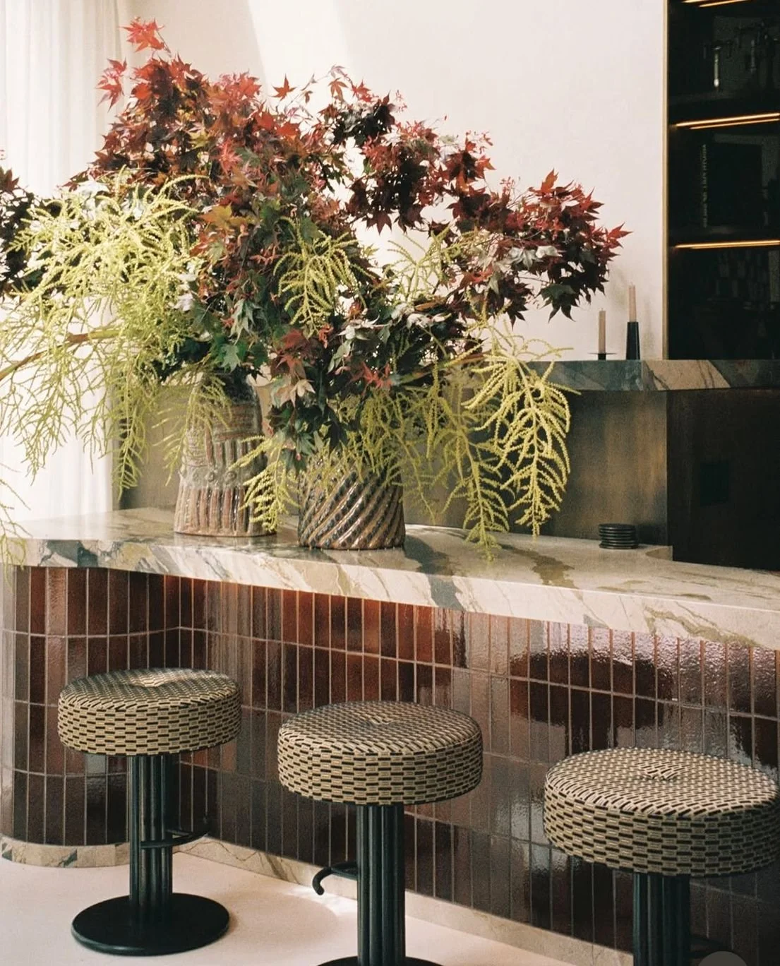
But colour isn’t doing all the work here. Texture is the secret ingredient.
Velvets, timber, ceramics, and textiles add depth and tactility, like seasoning in a really good meal. Without texture, even the best colour palette can fall flat.
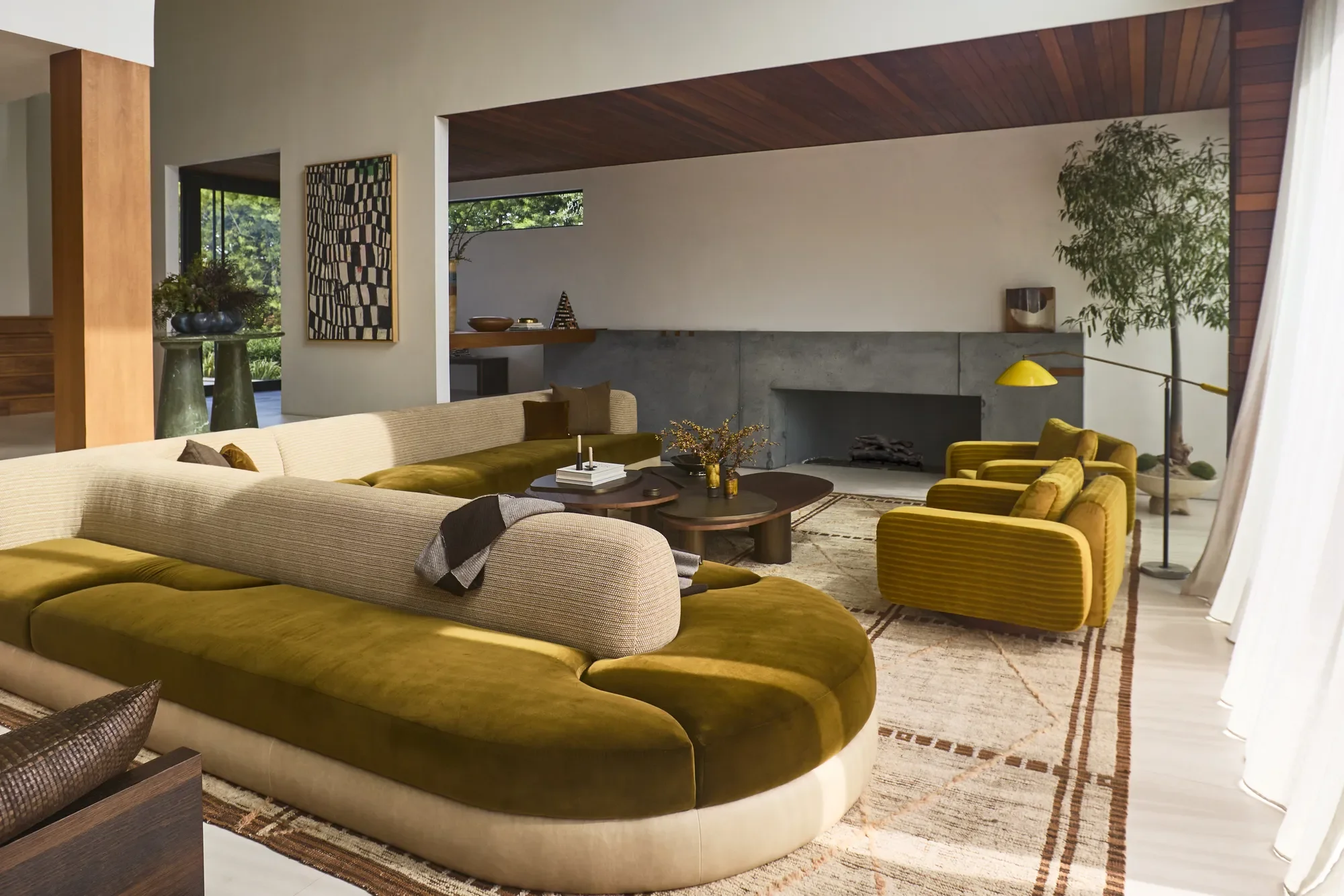
Image credit: Mark Durling. Design: Alana Marie Interiors. Home: Tania Sarin.
3. Greenery: The Element That Makes a Room Feel Alive
If there’s one element that instantly makes a space feel finished, it’s greenery.
Plants soften the hard edges of man-made materials like stone, tile, and cabinetry. They bring a layer of organic imperfection that interiors need.
They also introduce something static décor can’t - Life.
A tall olive tree or sculptural plant draws the eye upward, fills awkward corners, and gives a room movement and vitality.
It’s basically living art. Even a simple branch in a vase can transform a space from styled… to soulful.
4. The Power of Restraint
One of the most striking things about this home is what isn’t there.
There’s a clear sense of restraint.
No visual clutter. No over-styling. No unnecessary noise.
And that restraint signals something interesting in design psychology: confidence. Spaces that don’t feel the need to shout often feel the most luxurious. This is where the idea of “quiet luxury” comes in.
Instead of filling every surface, the design allows for breathing room. That visual silence creates calm, something our brains are craving more than ever in a world overloaded with information.
The result? A space that feels grounded, nurturing, and effortlessly sophisticated.
5. A Subtle 70s Revival
There’s also a gentle nod to a 1970s colour palette: warm, loungy, slightly subdued. Deep greens, earthy burgundies, warm neutrals.
It feels nostalgic without being retro.
The 70s revival we’re seeing across design and fashion right now is rooted in a desire for comfort, personality, and self-expression. It’s less about perfection and more about soulful spaces that feel lived in.
And that’s exactly the vibe here. Relaxed. Textural. Human.
If you loved this, make sure to check out my video breakdown of this viral interior here.
- Cass x